Orace HRIS: Redesign + Rebrand
I Got 99 Problems and Bad HR Software is #1
Most people reading this probably don’t know what an HRIS is – HRIS stands for “Human Resources Information System”. The purpose of an HRIS is to act as an comprehensive hub for employee personnel information but what a good HRIS should also do is streamline essential HR business processes. As a former HR professional I’ve worked with many HR Information Systems over the years, most of which with terrible user interfaces. While consulting at DIligent Corporation, an eGovernance Software company, I immediately noticed how difficult Oracle, their dedicated HRIS, was to use – both from an admin and basic user prospective.
Let me give you some general information on Oracle. The particular HR product Diligent was using is their HCM (Human Capital Management) web based cloud solution - the word 'solution' being used loosely. The HCM product promises to act as a one-stop shop for talent management, workforce rewards, workforce management and more. It is also configured to allow businesses to customize the look and feel with their own branding. However, Diligent's specific site did not live up to this promise.
The system, like many others, looks and feels dated causing many users to question its integrity and security. Allow me to state that I’m not a proponent that design trend should be prioritized over usability. However, it’s important that an interface feel modern as it better establishes user trust. This is a persistent issue within the HR Software space. Though newer softwares like Namely and Kin HR have designed their interfaces in a way that is both contemporary and easy to use.
Below is an overview on alternative solutions I designed for Oracle processes that were most difficult to accomplish, yet should have been easiest. I have based this re-design + rebrand on my key takeaways from using Namely in a previous role, which in my opinion is the cadillac of HR Information Systems.
Problems + Solutions
· Cluttered + Elusive Navigation
The global navigation is pretty much located only on the home/dashboard page. None of the 10 navigation items (as displayed in the left-hand image below) are accessible from other areas of the site unless you click the toggle located in the upper-left-hand corner, which presents a much longer all encompassing menu that requires that you sift through over literally 50 navigation options under 10 categories. Overwhelming much?
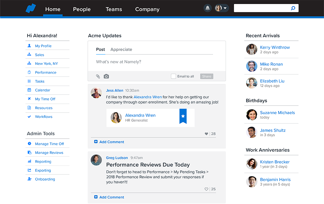
In contrast, here is an example of what Namely’s homepage/dashboard looks like:
At a glance, it’s quite obvious what I can do on this page as the navigation is orderly and clear and the other essential features are straightforward. What is also present in Namely’s functionality that’s not in Oracle’s is the general newsfeed as well as the new hires/work anniversaries/ and birthdays feed. What problem does that solve? It both organizes and makes essential employee information readily available for company admins and HR professionals. Most forward-thinking companies build a sense of community by celebrating these milestones so why not make that information easily accessible?
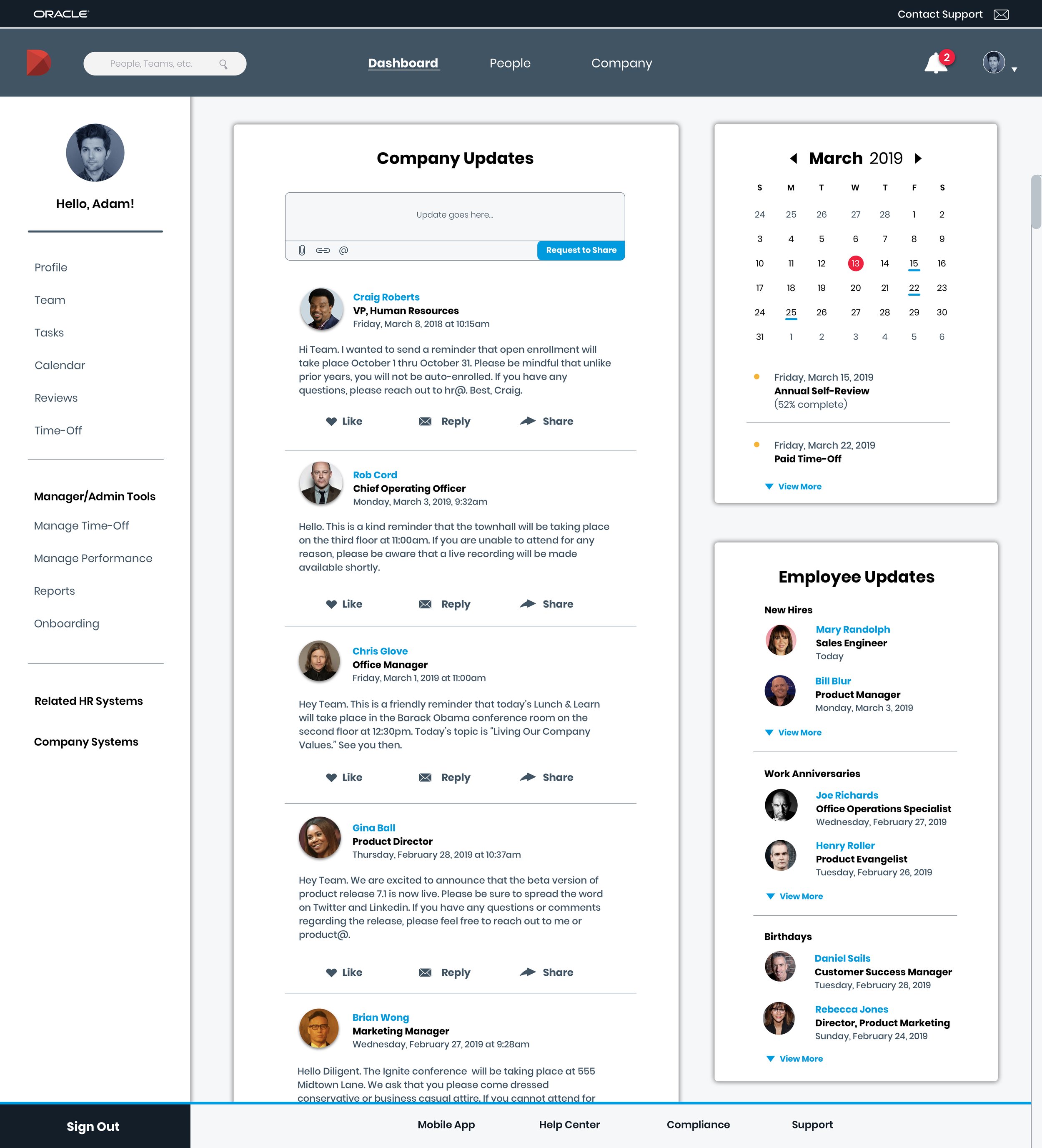
Below is my dashboard redesign as inspired by Namely:
Dashboard Redesign – Desktop View
Dashboard Redesign – Mobile View
First, I set out to develop a simple global navigation, which is accessible on any area of the site, rolled into 3 simple categories: Dashboard, People, and Company.
On the Dashboard page, I took a cue from Namely and consolidated the most used features/pages (Profile, Time-Off, Performance Reviews, etc.) into the page specific navigation for easy access. In part I based this updated nav list off of data pulled from our internal HR ticketing system which indicated that many employees were unable or experienced difficulty in locating these features/pages.
HR Information Systems and Benefits and Intranets, oh my!
Another issue plaguing Diligent and many other companies is having to juggle and keep straight multiple HR systems. For US employees, Diligent has over 5 HR systems that serve individual purposes, Oracle aside - an enrollment system for medical benefits, their medical carrier’s website, their 401K provider, a commuter benefits system, an intranet, and the list goes on. In turn, I added in two customizable fields to the dashboard page navigation that would easily connect users to related HR systems as well as general company systems.
It’s helpful for employees to be able to have other related systems readily available. Perhaps they go to Oracle but they actually meant to go to the intranet – it’s not uncommon for employees to confuse their company’s HR systems.
Calendar
Namely’s calendar feature, as shown above, keeps employees up-to-date with (similar to their feed) birthdays, work anniversaries, new hires as well as scheduled time-off. Another problem that I’ve encountered at Diligent and many other companies I’ve served is that there’s not a go-to area within the dedicated HRIS that keeps employees informed on upcoming HR specific occurrences. Similar to Namely’s calendar, I created a similar feature that would be that hub.
I wanted to focus on items that live within the system like performance reviews and time-off as well as occurrences that were specific day-to-day operations like payroll dates.
Multiple user profile pages that are confusing to use
Currently, there are two user profiles within the Oracle system. One is accessed by selecting “About Me” on the homepage and the other by searching for yourself under the “Directory” page. The “About Me” profile houses your personal information and the “Directory” version is public facing. But why do these pages have to be separate? Furthermore, the public facing profile is a bit of pain to get to. It requires users to take the following steps – select "Directory" from the dashboard, type their name and search for themselves, then select their profile... In the spirit of Steve Krug, why are you making me think?
Profiles are something that Namely does very well, consolidating your basic (public) and private information into one page with visibility that is controlled by user-role provisions. Namely also makes clear what you can do when you’re inside your profile. It’s organized into clean and concise categories where you can update your personal information, view your compensation details and benefits elections, take a look at your team’s org chart, or set goals and complete performance reviews. Basically anything about you can be found on this page which eliminates guessing games and reduces time spent muddling through:
The redesigned profile page below consolidates the public and private – the private information only visible to the user, their manager, and the HR team. This of course alleviates the annoyance of having to go to two pages to view and update information and removes the responsibility of having to recall which page serves which purpose.
Profile Redesign – Desktop View
Profile Redesign – Mobile View
· Entering time-off is not as easy and obvious as it should be
The below is an image of Oracle’s time-off page. From an initial peek, it’s not immediately clear to users what they can do on this screen and more importantly, the page does a poor job of highlighting the central action that users visit this page to do: request time-off! In order to enter a request, you must click the very tiny "Add" button located towards the top-left of the screen, which stands out in no way, shape, or form (though I circled it below for reference.)
It would be an understatement to say that Oracle’s time-off feature is one of the HR team’s essential troubleshooting pain points. In this aspect of the redesign, it was important to ensure that the time-off page encompass and make easily available key information that an employee would come to this page in search of. “How do I enter time-off?” “What is the status of the last time-off request I put in?” “How many days sick days do I have again?” Thus, I added in some details that were lacking but very much needed: list of recent requests, ability to search previously entered requests, and a list of all recognized leave types.
Time-Off Profile Redesign – Desktop + Mobile View
Additionally, it was essential that the redesigned time-off request step-by-step process be intuitive and direct.
What the heck is Document Records?
The Document Records (also known as “My Documents”) feature acts as a document repository where employees and HR admins can share and store files. Conceptually this is awesome. In theory, this saves both HR admins and employees from having to ponder questions like “did John send me his W4?”or “did I send my expense request to HR?”
My first issue to raise is that the feature has multiple names. For admins, when looking at employee profiles, it’s simply called “Document Records”. For employees (basic users), it’s called “My Documents.” I’m not quite sure why Oracle didn’t decide to use one consistent title. Perhaps the thinking may be that since the two names both contain the word “documents” that users wouldn’t get confused. I was able to figure out that the two were one in the same by once again taking to the admin console and testing it. But geez, so much investigative work! Don’t you know how busy I am? I kid, I kid. But really.
Discoverability is another issue. Due to the way the navigation is configured, the feature is very easy to miss altogether. For basic users, which make up the majority, it’s tucked away within the private profile section – see below:
As I did with “time-off”, I wanted to ensure that "Document Records" – which I’ve rebranded as “Uploads” – was in an obvious place, the employee profile:
In this particular segment of my redesign, I drew inspiration from superior tools like Google Drive and Dropbox which have similar functionality. The current process for adding a file in Document Records as an employee is lengthier than necessary. After clicking the plus-sign button, you’re brought to a screen that prompts you to categorize document type from a long list of options that only displays the first nine, meaning you’re unable to see what the other remaining options are. If you cannot find what category best suites your file within the search dropdown, then you must choose whichever is most similar. There’s no “other” category option:
I wanted to ensure that there was a bit more flexibility for categorizing uploads. Often when an employee is forwarding a document to HR or vice versa, there's not always necessarily a firm category to assign it to. In the new Uploads world, there are customizable folders for tidy organization instead.
This gives users the option to upload to a specific categorized folder or simply to the general Uploads folder.
As with the "time-off" section, I wanted to recreate the step-by-step upload process in a clear and straightforward manner.
Make it stand out.
It all begins with an idea. Maybe you want to launch a business. Maybe you want to turn a hobby into something more. Or maybe you have a creative project to share with the world. Whatever it is, the way you tell your story online can make all the difference.
Make it stand out.
It all begins with an idea. Maybe you want to launch a business. Maybe you want to turn a hobby into something more. Or maybe you have a creative project to share with the world. Whatever it is, the way you tell your story online can make all the difference.

“It all begins with an idea. Maybe you want to launch a business. Maybe you want to turn a hobby into something more. Or maybe you have a creative project to share with the world. Whatever it is, the way you tell your story online can make all the difference.”
— Squarespace


