National Grid Redesign
National Grid's Website is in Hot Water
If you’re not a resident of the East Coast (or the United Kingdom), it’s very likely that you’ve never heard of National Grid, a multinational electricity and gas utility company. Living in NYC, it’s pretty much your only option. Below discusses the inconsistent branding on nationalgridus.com and how my redesign addresses the overlooked sections of their site.
Login Page
Every month I use their website to pay my monthly heat and gas bill and every month I am greeted with this screen upon logging into my account:
It doesn’t take a design evangelist to see that this is a poorly configured login page, branding aside. My biggest grievance is that in 2018, National Grid took steps to redesign and rebrand multiple sections of their website but neglected others, this one included. In addition to its completely outdated style, the cluttered elements and lack of a clear visual hierarchy make this UI a design nightmare. Below is an example of the brand refresh they conducted on their homepage for desktop (side note: their site is not currently responsive):
It’s clear from looking at their current homepage, that branding was a priority – more deliberate and strategic use of a defined color palette, clean and concise navigation, etc. While following this updated brand and style, I focused primarily on establishing that stronger sense of hierarchy as well as ensuring all elements were discoverable:
Login Page Redesign – Desktop + Mobile View
· Account Dashboard
Once you’re logged in to your account, you’re taken to this account dashboard screen:
As you can see, the dashboard page suffers from many of the same issues as the login page. Thus in addition to focusing on hierarchy and discoverability, it was also essential to develop a central focal point, which the current UI is lacking. Con Edison, an electricity provider within the same competitive space, did that quite well when revamping their site in 2018. Below is a screenshot of their dashboard:
In borrowing from Con Ed, I made the account balance the central focal point of the dashboard as majority of users visit the site in order to view and pay their bill.
Dashboard Redesign – Desktop View
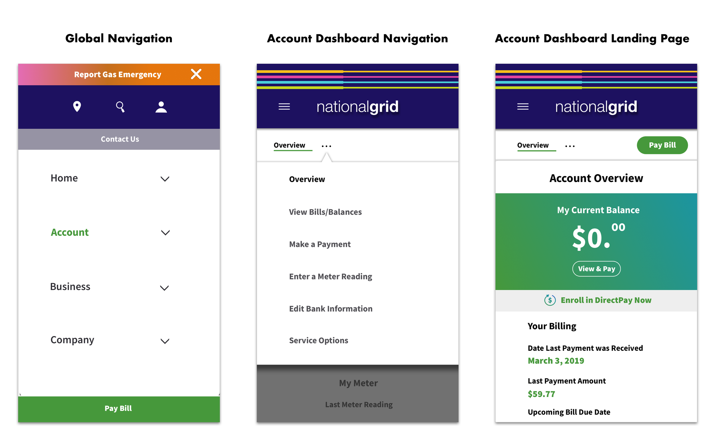
Dashboard Redesign – Mobile View
It was also important to streamline the navigation and consolidate certain options. For example, National Grid has a sideways feedback button on multiple sections of the site but I felt that for efficiency that be could be rolled into the “Contact Us” option.
It goes without saying that National Grid obviously should update the above referenced outdated sections of their site. When it comes to usability and branding, they should really take a cue from Con Edison and prioritize consistency.


